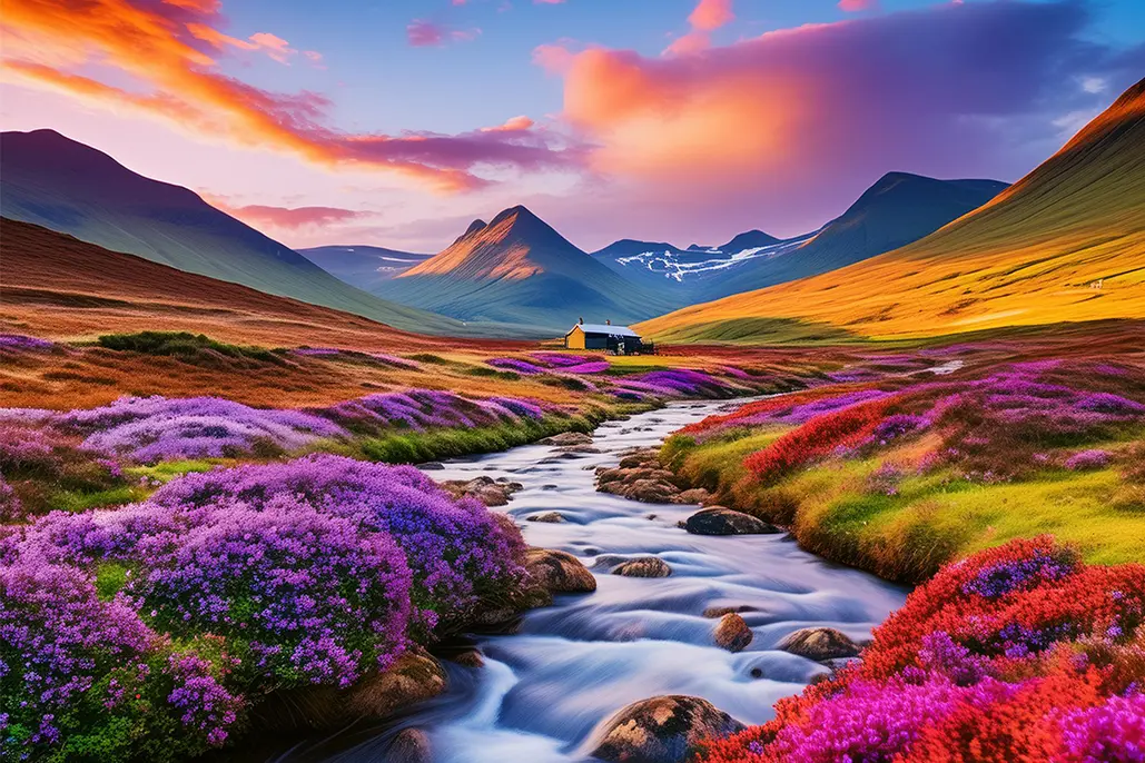
Scotland’s landscapes are a vibrant tapestry of colours, from the deep blues of its expansive lochs to the lush greens of its rolling hills.
For designers and brands, these natural hues offer a palette of inspiration that can bring authenticity, emotion, and depth to their creations.
In this post, we explore how the Scottish landscape’s rich colour scheme can be translated into design and branding strategies that resonate on a global stage.
Embracing the Greens of the Glens
The glens of Scotland are renowned for their breathtaking beauty, marked by vibrant shades of green. This colour symbolises growth, vitality, and renewal. Brands looking to convey sustainability and organic quality can draw from this palette. For example, a natural skincare line might adopt these green hues in their packaging and branding to emphasise their commitment to eco-friendly products and practices.
Capturing the Blues of Scottish Lochs
The serene blues of Scotland’s lochs evoke feelings of calm and reliability. This makes blue an ideal choice for brands that wish to promote trust and dependability. A financial services company could use these shades in their visual identity to subconsciously communicate stability and confidence to their customers.
The Heather-Hued Highlands
Scotland’s highlands are often carpeted in the beautiful purple tones of heather. Purple is frequently associated with creativity and luxury. Luxury goods brands, such as those in the fashion or premium beverage sectors, can incorporate this colour to add a touch of elegance and exclusivity to their branding.
Golden Tones of the Autumnal Scots Pine
The golden yellows of autumn, especially seen in the Scots pine, are vibrant and energetic. This colour can be effectively used to attract attention and evoke a sense of optimism and energy. Sports brands or children’s toy companies can leverage these tones to reflect dynamism and fun in their products and marketing efforts.
Utilising Earthy Neutrals from Scottish Stone
The muted tones of Scottish stone provide a robust foundation for any colour palette, offering a sense of strength and resilience. These earthy neutrals are perfect for brands aiming to project an image of durability and timelessness. Home decor and furniture businesses, for example, can use these colours to evoke a sense of longevity and craftsmanship in their products.
Integrating Colour into Branding Strategies
When integrating these natural colours into branding, it is crucial to consider the emotions and associations that each hue invokes. By aligning the colour choice with the brand’s values and message, businesses can create a powerful visual identity that stands out in the market.
The Power of Natural Inspiration
The Scottish landscape offers more than just visual splendour; it provides a source of inspiration that can enhance how brands communicate their identity and values. By drawing from Scotland’s natural palette, businesses can develop a distinctive and appealing brand aesthetic that resonates with their audience globally.
Stand Out in the Market with Taesea’s Innovative Solutions
If you’re interested in learning more about how Taesea can assist your business in developing your brand, marketing, and design requirements, please do not hesitate to contact us. We have a team of experts who are passionate about creating innovative and effective solutions that will help your business stand out in the market. Contact us today to learn more about our services and how we can help your business succeed.


