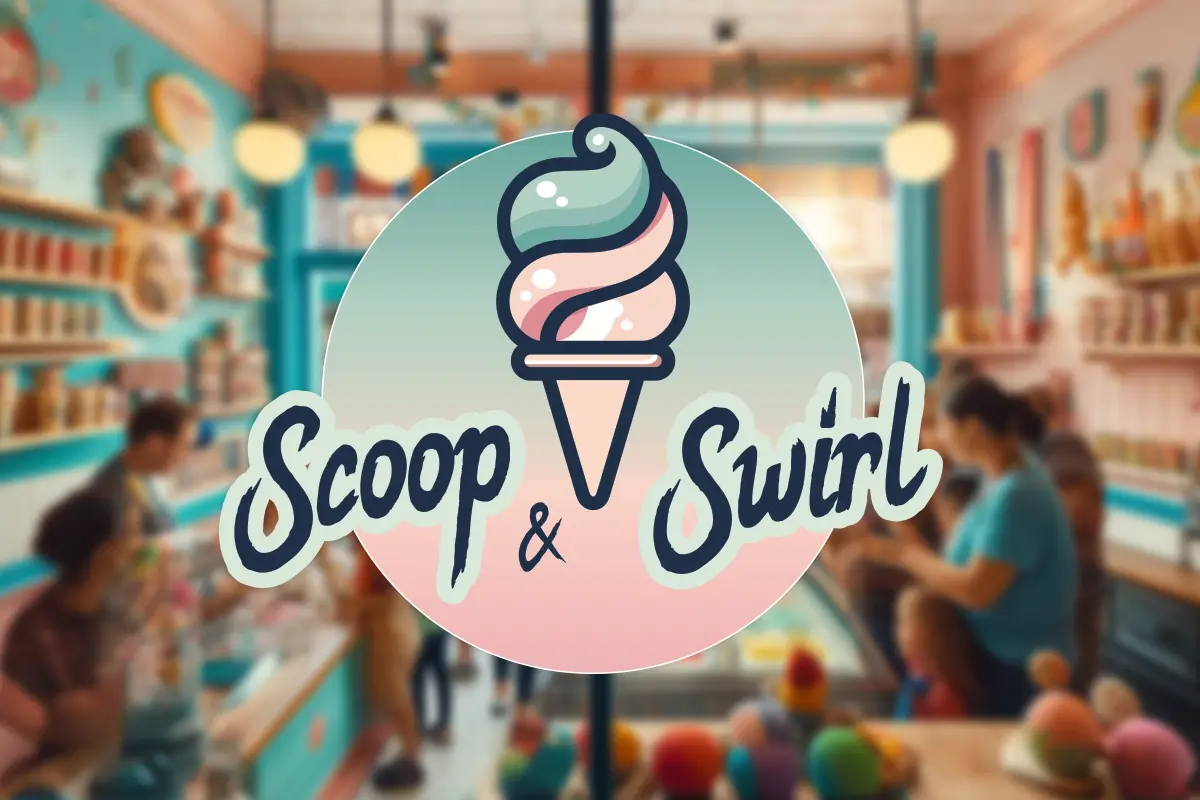
The new Scoop & Swirl chain of seaside ice cream shops approached us to create a logo that not only attracts customers but also reflects their playful and appealing brand identity.
The Scoop & Swirl logo design creates an inviting, fun, and memorable brand image that immediately communicates the essence of an ice cream shop and will attract customers looking for a joyful and tasty experience.
Our design team chose soft pastel colours (mint green, light pink, and white) to evoke a sense of sweetness and fun, which are often associated with ice cream and desserts. These colours are not only visually pleasing but also create a light-hearted, welcoming vibe that aligns with the brand’s identity.
For the typography, we chose a casual, hand-drawn script font for “Scoop” and “Swirl” to add a personal, friendly touch to the logo. This choice makes the brand feel approachable and down-to-earth, with slightly irregular strokes mimicking the organic nature of ice cream scoops and swirls.
The stylised ice cream cone with a swirl of ice cream on top serves as the central element, and the ice cream cone is placed against a circular background that fades from mint green to pink. This circular design frames the icon and text while representing the cyclical, swirling nature of the product. The gradient effect adds depth and a modern touch to the logo.
We think that this logo effectively captures the spirit of the brand, making it appealing to customers of all ages.