Exploration, adventure, and a love for the great outdoors are some of the core values of Taesea.
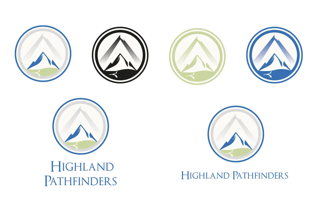
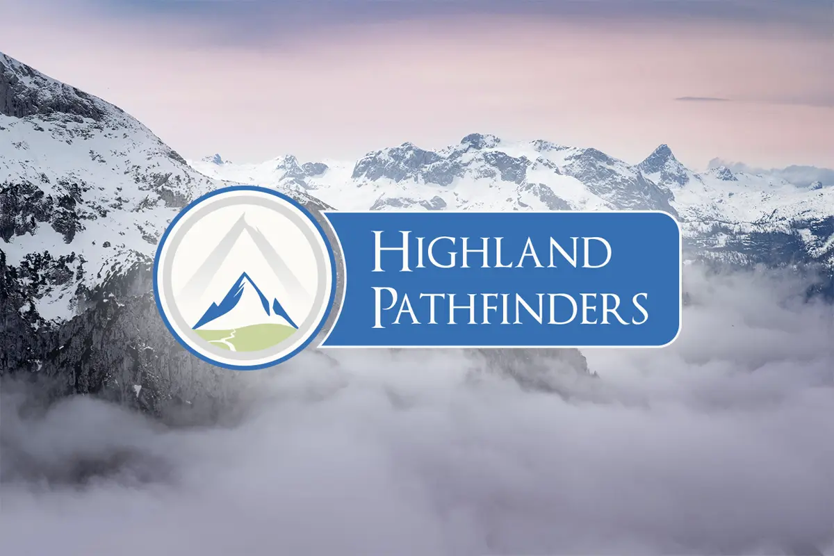
When the outdoor company Highland Pathfinders asked us to design a new logo, we jumped at the chance.
The most prominent feature of the logo is the mountain imagery, which represents strength, adventure, and exploration. The curving line that flows into the mountain’s base resembles a path or trail leading towards or coming from the hill, symbolising the journey or path that the ‘pathfinders’ take or create in their exploration.
The circular shape enclosing the mountain is reminiscent of badges used in national parks or emblems for exploratory groups, giving the logo a seal of authenticity and a sense of belonging to a community of explorers. The use of blues and greens indicates nature, reinforcing the brand’s outdoor, nature-centric theme.
The typeface choice is classic and straightforward, which conveys reliability and tradition, suggesting that the organisation values these principles or has a long-standing history.
The simplicity of the design makes it versatile and easy to recognise, which is essential for brand recognition. The minimalistic approach also focuses on the essentials, a common philosophy in hiking and outdoor activities.
Overall, the design thought behind this logo is to communicate the core values and activities of the Highland Pathfinders, such as exploration, respect for nature, adventure, and community.