Glen Heather Highland Gin is a premium gin launching in Q4 of 2024 and is produced by a small independent distillery in the North of Scotland.
The design work sets it apart from the rest thanks to the attention to detail and the unique aesthetic.
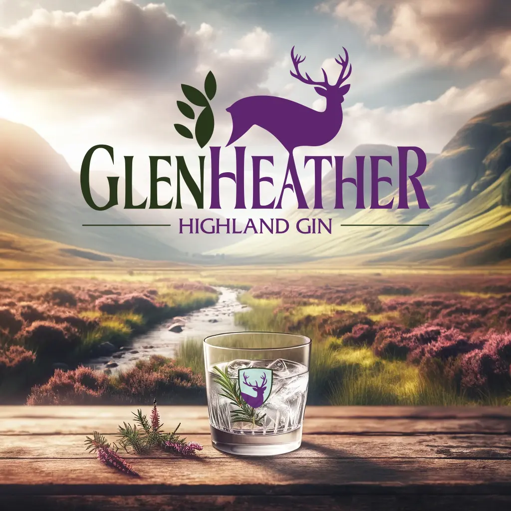
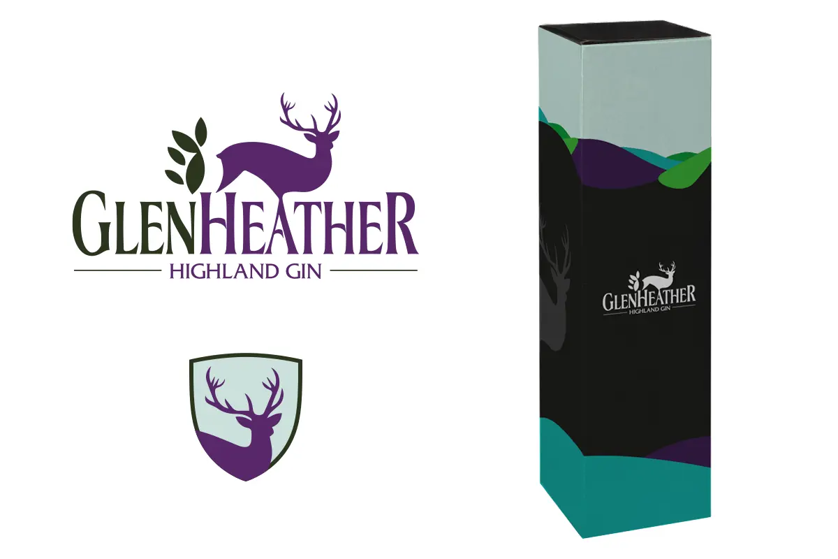
The logo of Glen Heather Highland Gin depicts a stylised deer with prominent antlers. The leaves accompanying the deer signify a natural or forest environment typically associated with the highlands. The typography for “GlenHeather” is elegant and serif, which gives the brand a traditional and quality feel. “Highland Gin” is written in a smaller, simpler sans-serif font.
The branding’s colour palette is purple, green, and soft teal. These colours evoke heather fields typically found in highland areas.
The packaging design is modern with a touch of elegance. The box features abstract hill-like shapes in purple and green. The logo on the front of the box is blocked out with foil, and elements around the sides are varnished on top of a matte laminate, making the design stand out.
The overall look of Glen Heather Highland Gin is modern and elegant, and it aims to represent the quality of the gin and its highland origins. The design also holds a hidden secret, a nod to another creature found living near the distillery – can you see the squirrel?
Taesea has been asked to provide marketing and further design services to support it’s launch.