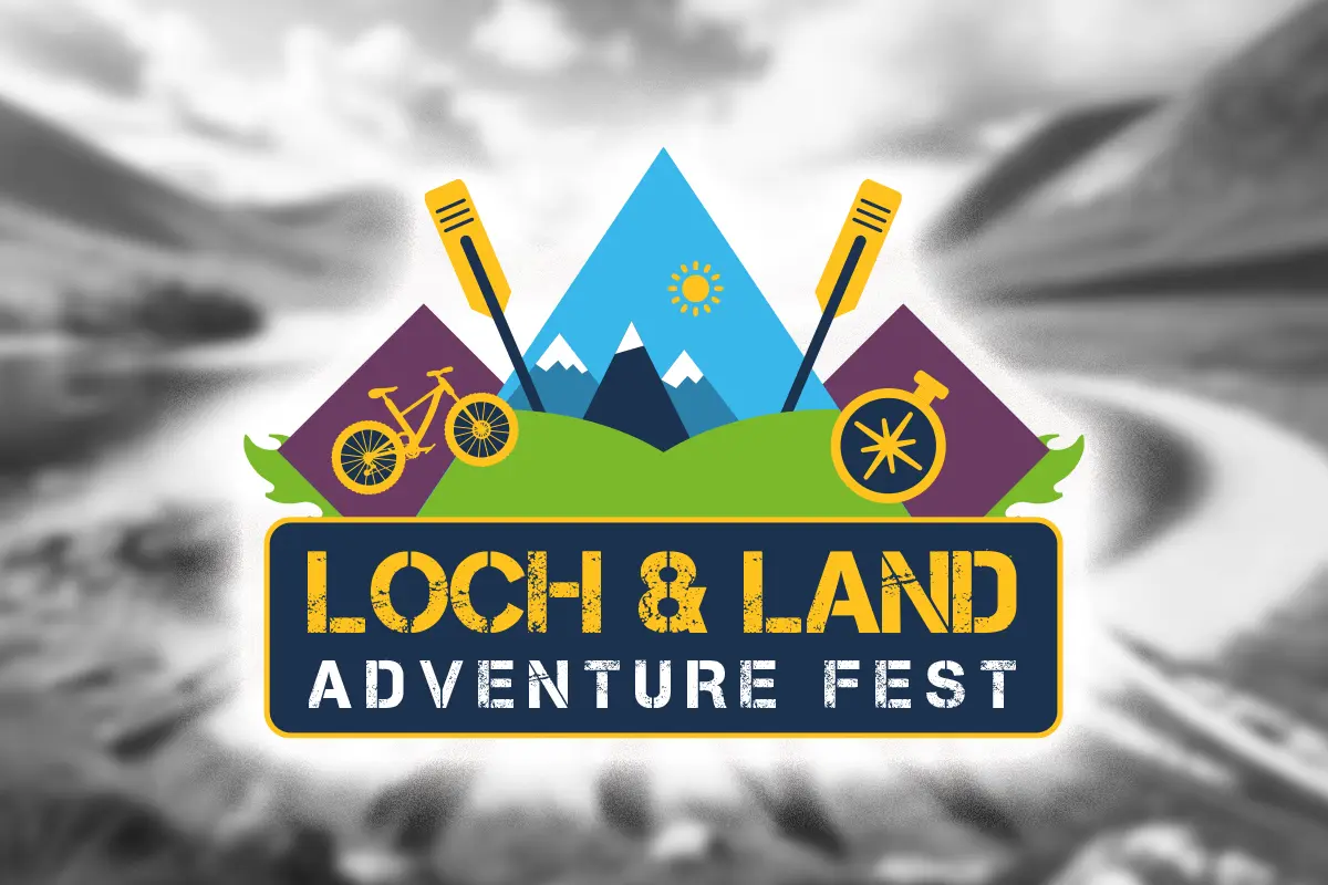
The Perthshire-based Loch and Land Adventure Fest organisers asked the Taesea team to create a logo and branding for this new and exciting event.
The logo was meticulously crafted with the utmost care to encapsulate the spirit of adventure and outdoor activities that the festival promotes.
Each design element was not just chosen but carefully selected to represent various aspects of the festival, including land-based and water-based activities, while also highlighting the natural beauty of the festival location. This attention to detail reassures the audience of the logo’s quality and relevance.
The festival’s visual elements symbolise rugged terrain, outdoor adventure opportunities, and water-based and land-based activities. They also convey a sense of energy and vitality that will excite potential attendees. The vibrant and energetic colour scheme and the typography align with the festival’s adventurous and outdoor theme, further enhancing the logo’s appeal.
Festival organiser John Wise’s feedback on the Loch and Land Adventure Fest logo was overwhelmingly positive. He noted that the emblem dynamically and visually engages with the festival’s adventurous spirit. “It combines elements of nature, adventure, and physical activity to attract outdoor enthusiasts and convey the vibrant and energetic atmosphere of the event. The balanced composition and thoughtful colour choices make the logo eye-catching and memorable. Taesea has done a marvellous job, and we look forward to working with them to promote the festival.”