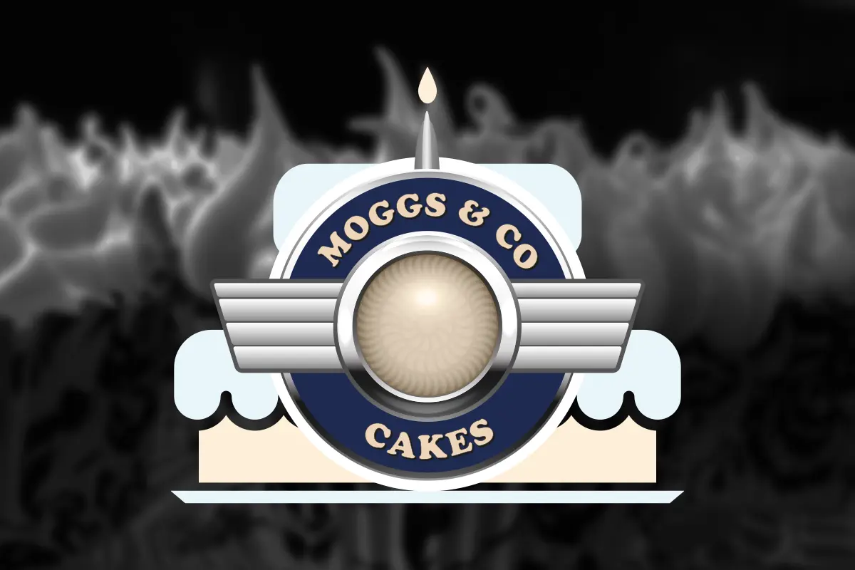
The logo for Moggs & Co, a bespoke cake maker based in Fife, Scotland, is inspired by the bonnet badge of the owner’s British vintage car.
At the heart of the logo is a central circular element that resembles a car badge, specifically the iconic bonnet badge of the vintage Morris.
This central motif gives the logo a classic, nostalgic feel, aligning with the car’s vintage theme. The round shape suggests a cake, playfully tying back to the business’s core focus on cake making.
Flanking the central circle are wings, a common feature in vintage car badges. These wings are not just a design element but a symbol of Moggs & Co’s commitment to quality and creativity. They signify speed, quality, and craftsmanship, attributes associated with classic cars and desirable in a bespoke cake maker.
The colour scheme is subdued and classic, reflecting the vintage theme. Using navy blue and cream gives the logo a timeless and elegant look, suggesting sophistication and high quality, essential qualities for a bespoke cake maker. A small candle flame at the top of the logo subtly indicates that the central circle represents a cake, adding a celebratory element that suggests Moggs & Co cakes are perfect for special occasions.
The logo’s overall shape is symmetrical and well-balanced, evoking a sense of reliability and trust, which is crucial for building customer confidence in a bespoke service. By incorporating elements from the owner’s beloved car, the logo connects personal passion with professional craft, creating a unique and memorable brand identity for Moggs & Co.
Taesea also created a simple promotional website for the bakery which can be found at moggscakes.co.uk