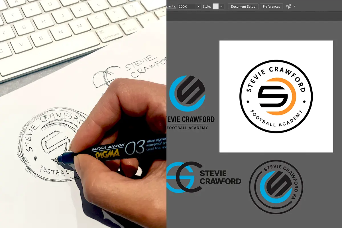
When the Stevie Crawford Football Academy approached us for a logo design, they were looking for something that would capture the dynamic and energetic spirit of their football training programs while maintaining a professional and modern aesthetic.
The logo for Stevie Crawford Football Academy prominently features a bold and stylish monogram “S” and “C” intertwined, symbolising unity and strength.
The use of these initials not only makes the logo easily identifiable but also adds a personal touch, connecting the academy directly with its namesake, Stevie Crawford, a renowned figure in Scottish football.
Our design team chose a striking colour palette of orange and black, which conveys energy, passion, and power—qualities that are essential in football. The bright orange stands out against the black, making the logo highly visible and memorable, whether it’s on a team jersey, promotional materials, or social media.
For the typography, we selected a modern, sans-serif font that is clean and easily readable. This choice reflects the academy’s forward-thinking approach and commitment to professionalism in training young football talents.
Additionally, we incorporated the circular shape of the logo, hinting at a football, which frames the monogram and the academy’s name.
Overall, the Stevie Crawford Football Academy logo encapsulates the essence of the brand: energetic, professional, and deeply connected to the rich heritage of Scottish football. This logo is designed to inspire young athletes and attract them to a place where they can develop their skills under the guidance of experienced professionals.
To learn more about Stevie Crawford Football Academy and stay updated with their latest activities, visit their Facebook page.


